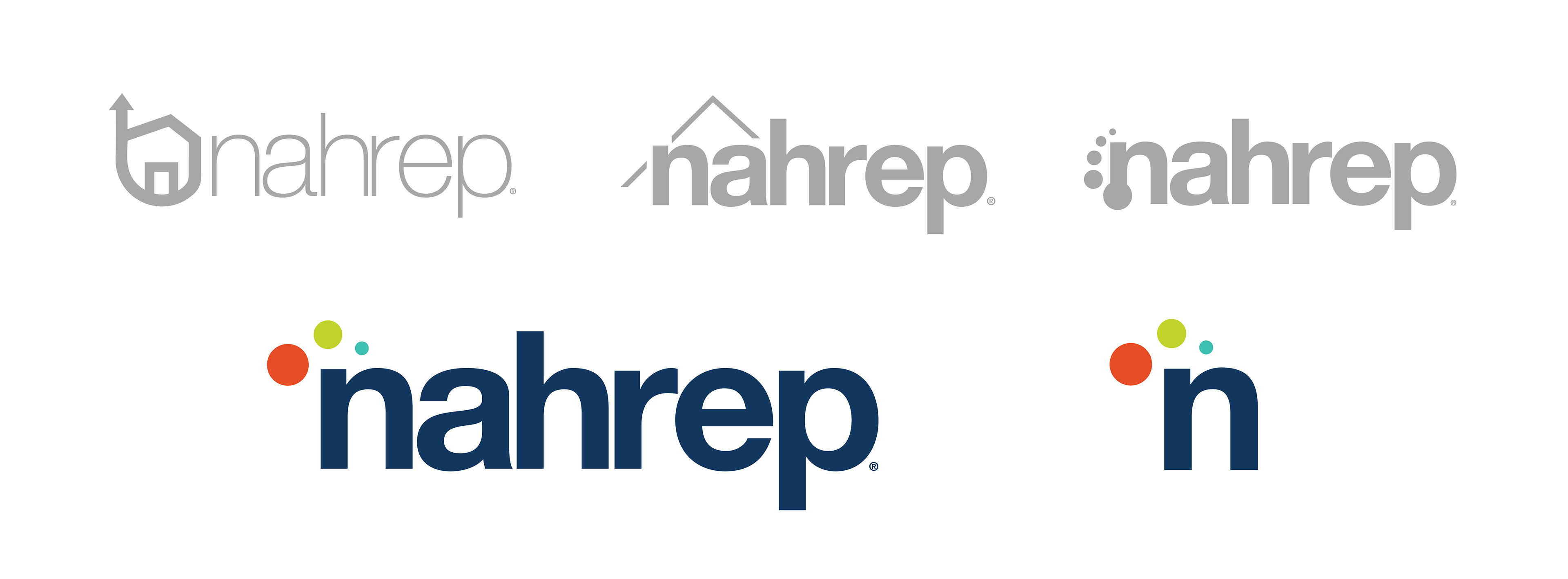
The original logo helped establish NAHREP's brand in the market as an important housing advocate. As the organization evolved and further defined its role in housing and economic empowerment, the board felt it was time to modernize the logo in a manner that reflected NAHREP's broader focus while maintaining a strong connection to its roots.
PREVIOUS LOGO
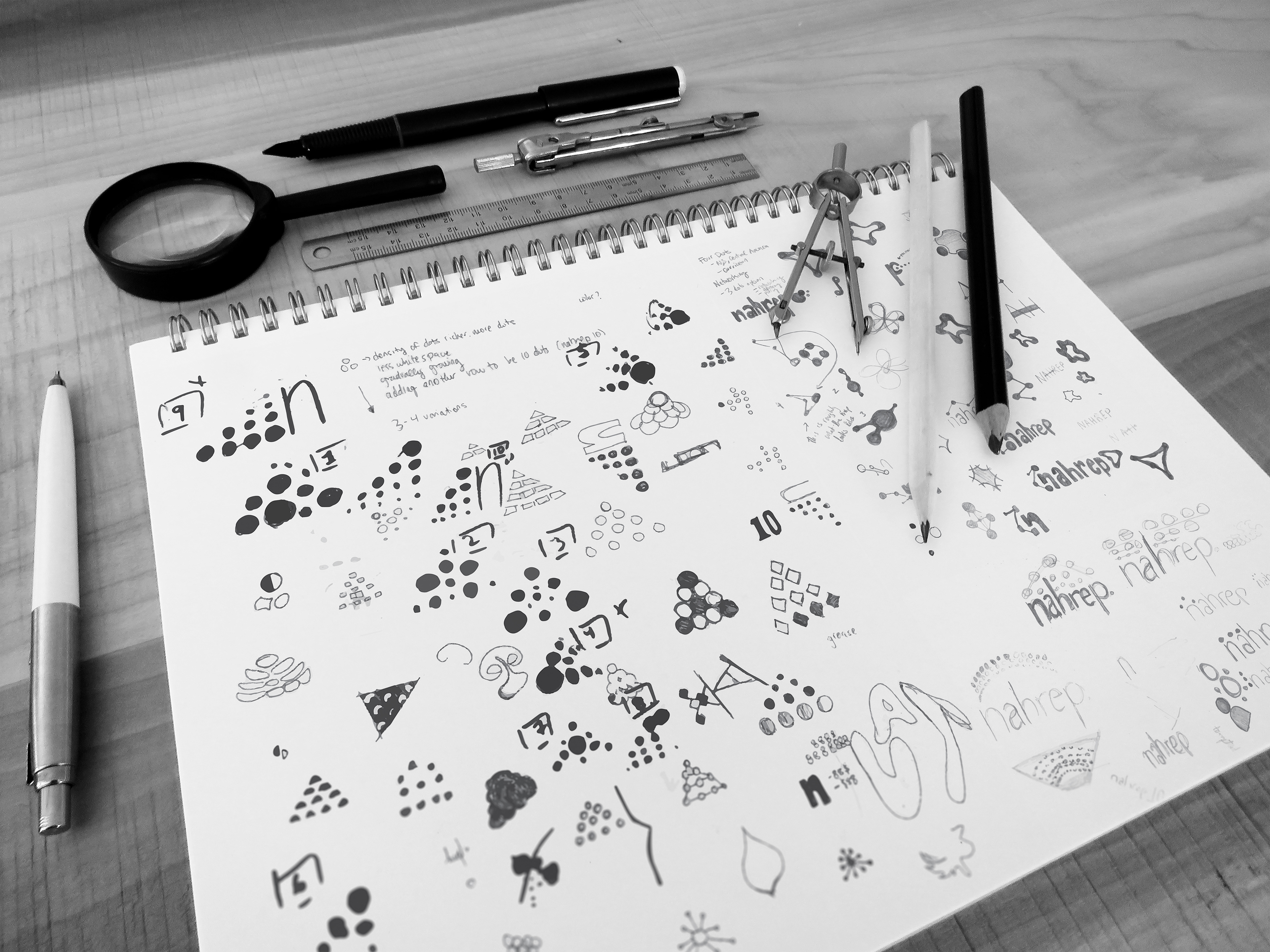
ENDLESS EXPLORATIONS
NAHREP'S original logo included the roof of a house, a nod to it's mission within the housing industry. As the company grew larger, NAHREP became inclusive to more than just housing and real estate. For the new logo, we wanted to place emphasis on the diversity within our organization while highlighting our mission statement.
FONTS AND COLORS
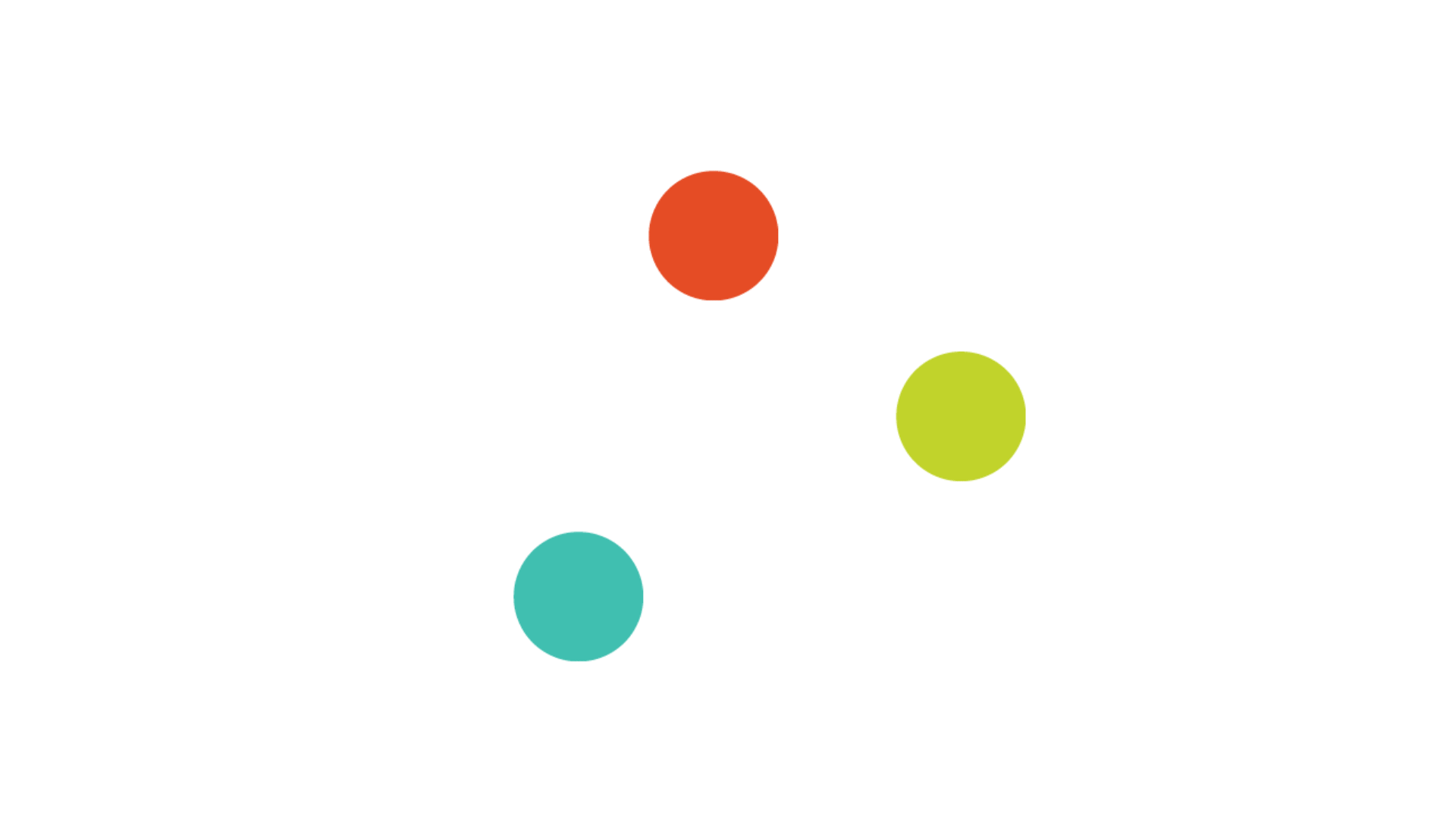
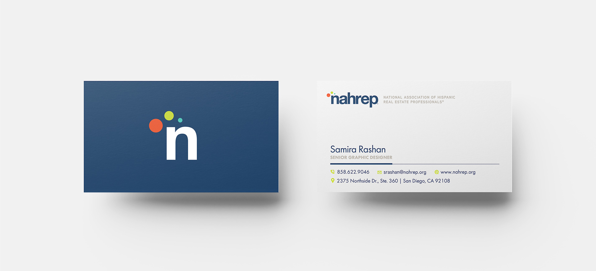
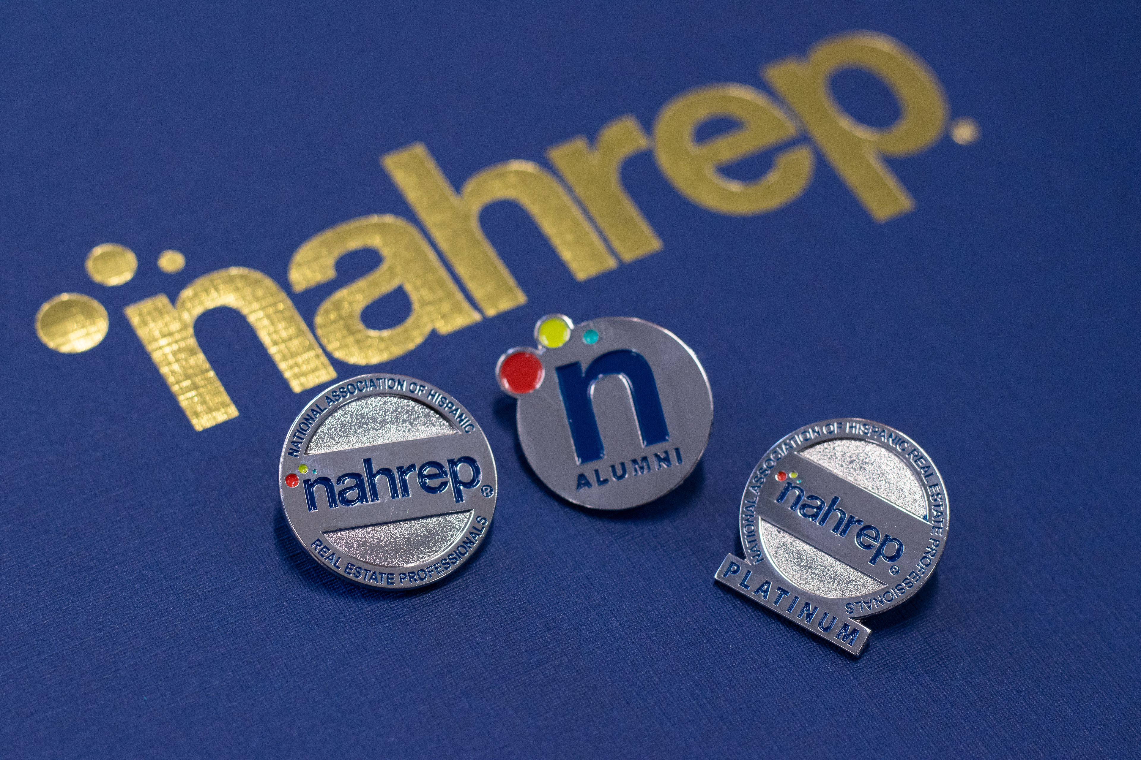
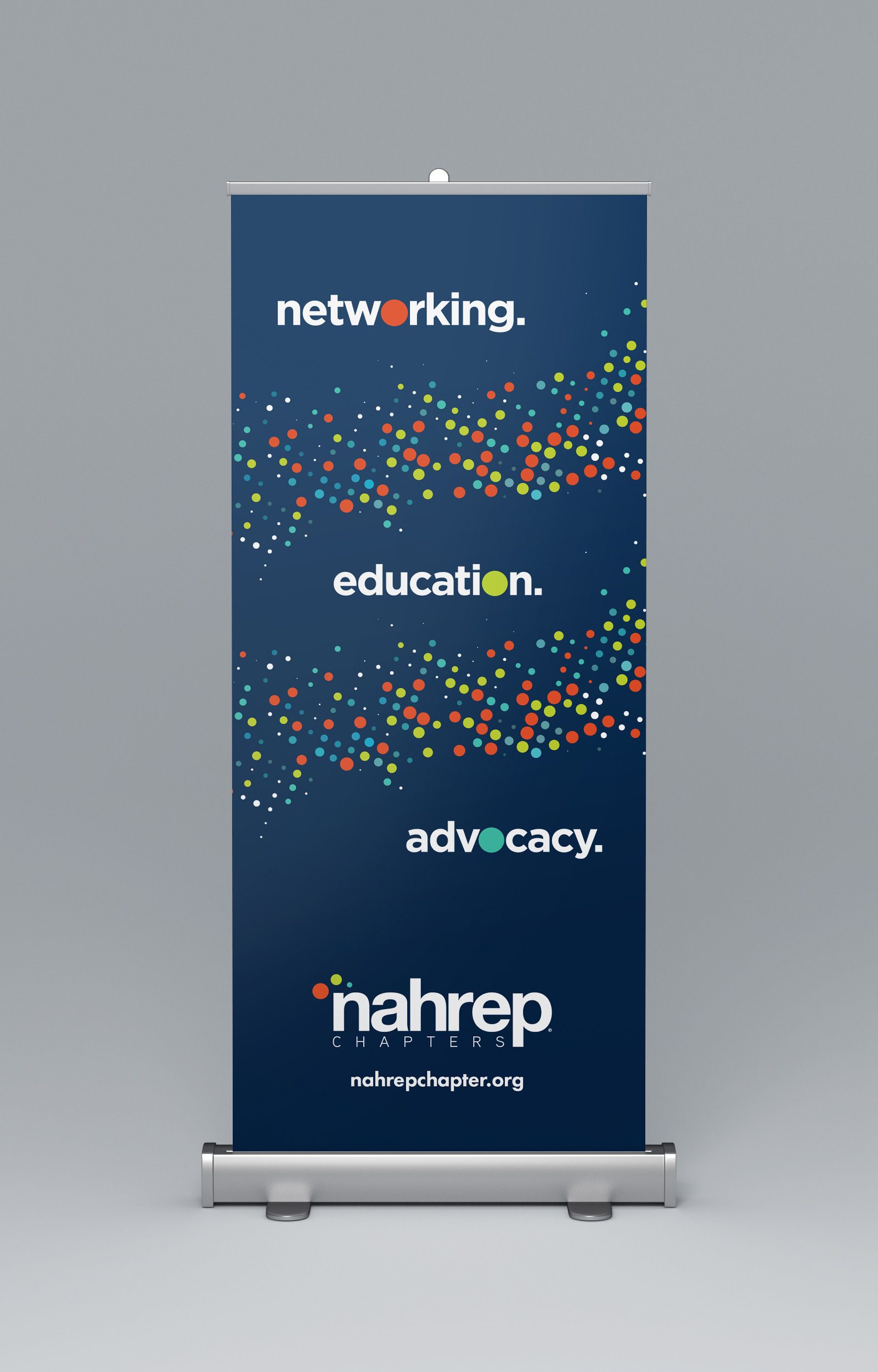
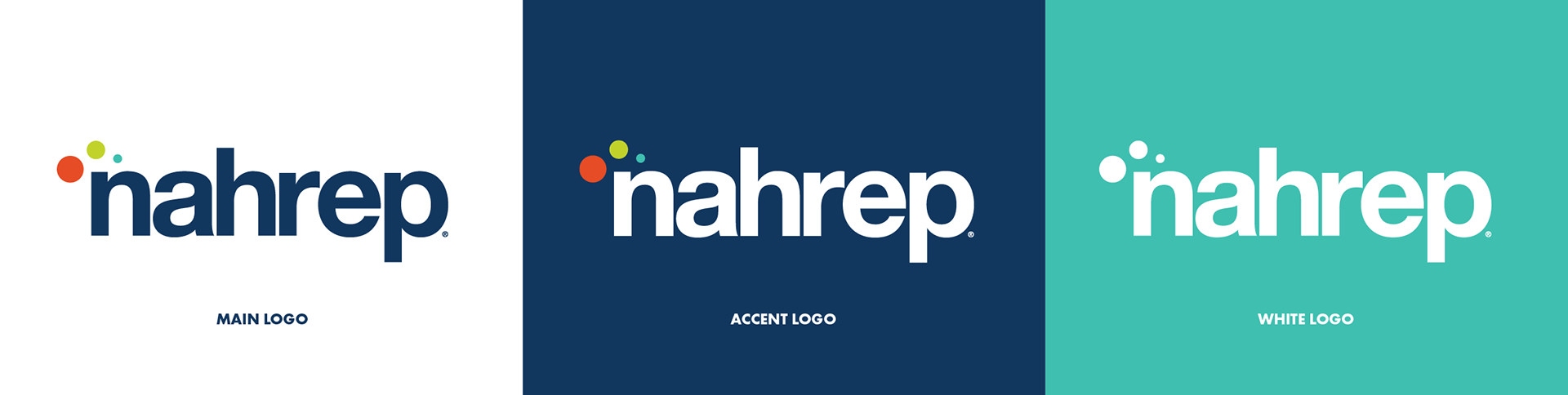
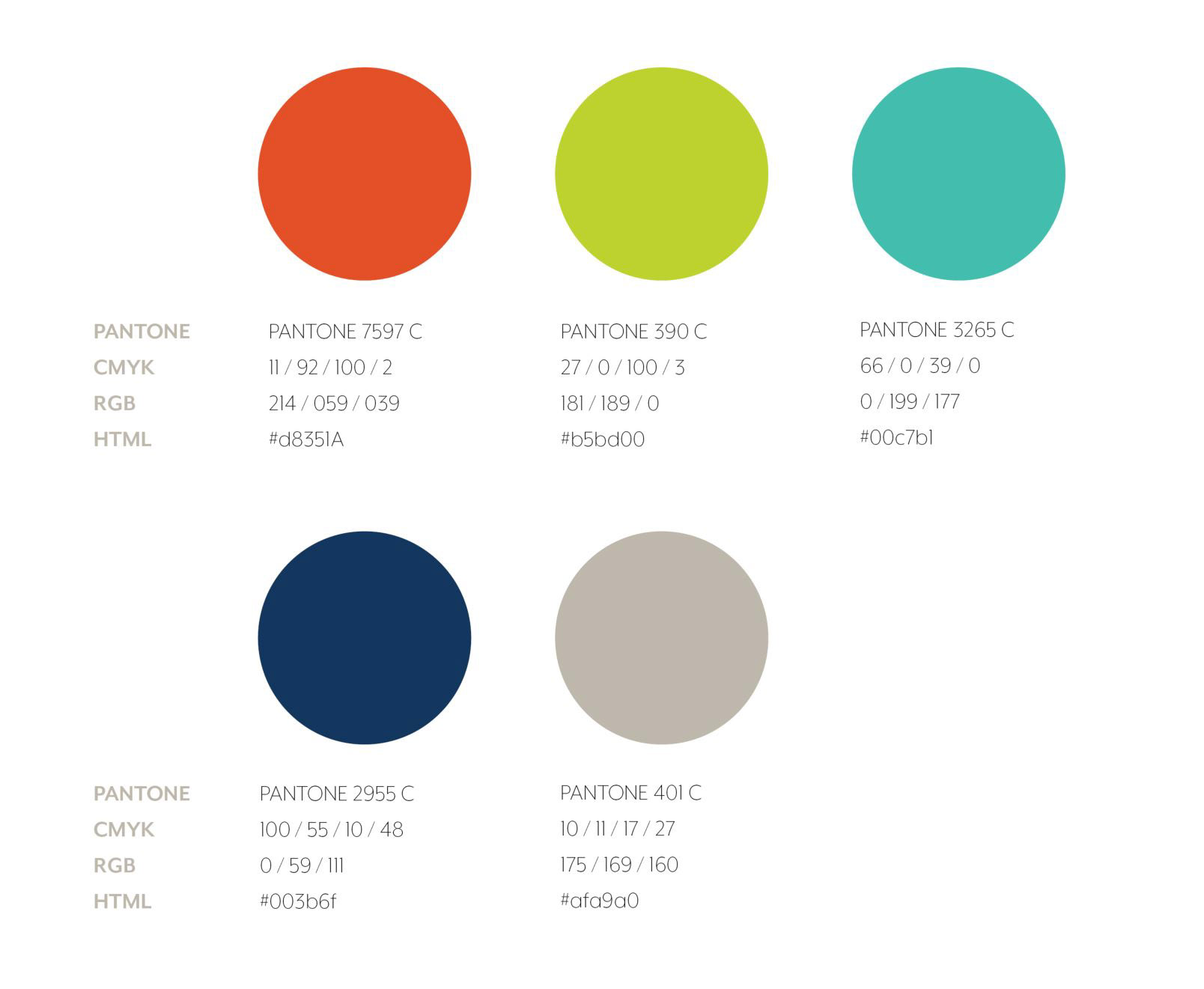
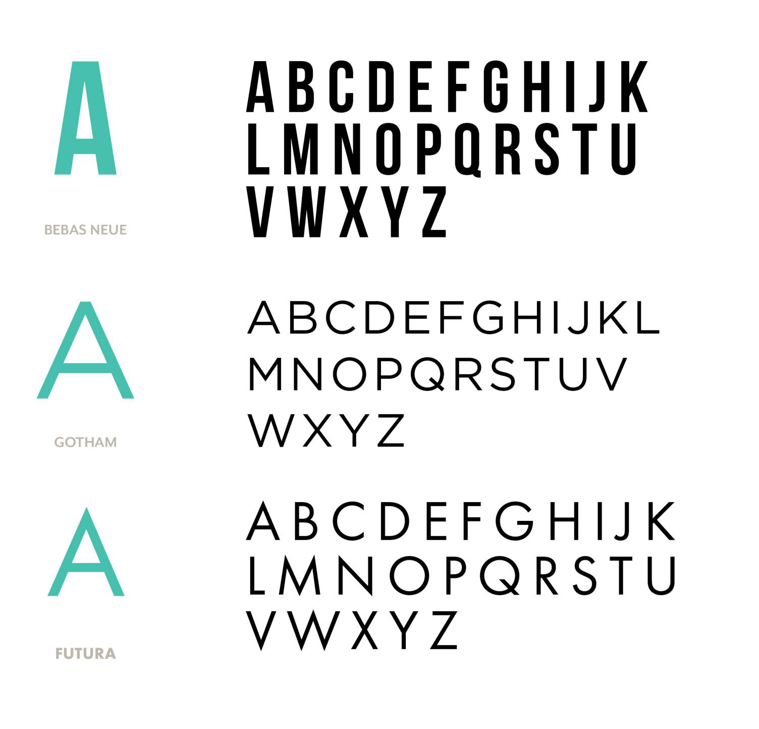
Breaking away from NAHREP's original monotone brand, the new concept introduces vibrant colors that reflect the company's rich culture and enthusiastic membership. Futura became NAHREP's primary font, modernizing the company's image.
BRINGING IT ALL TOGETHER
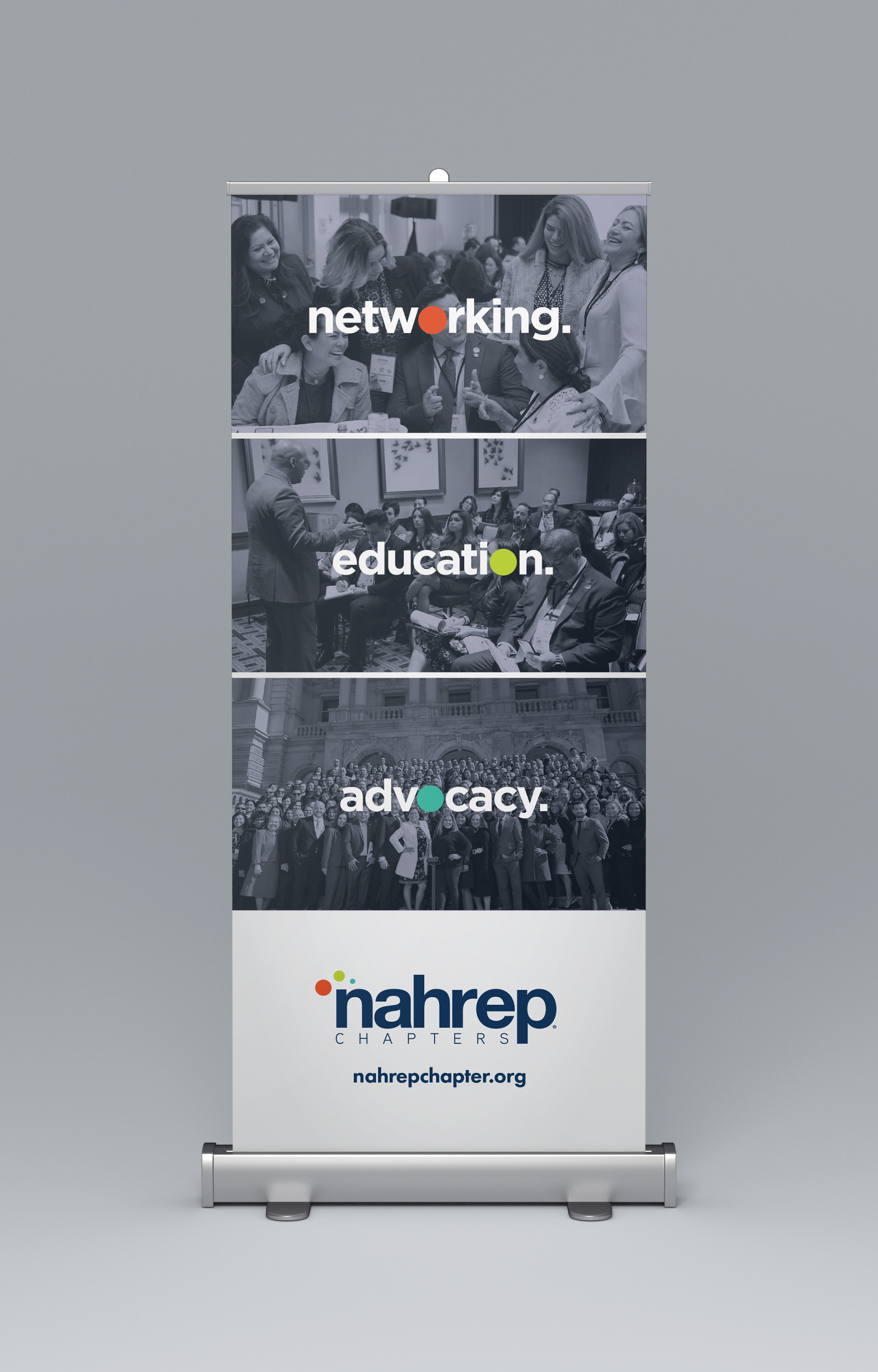
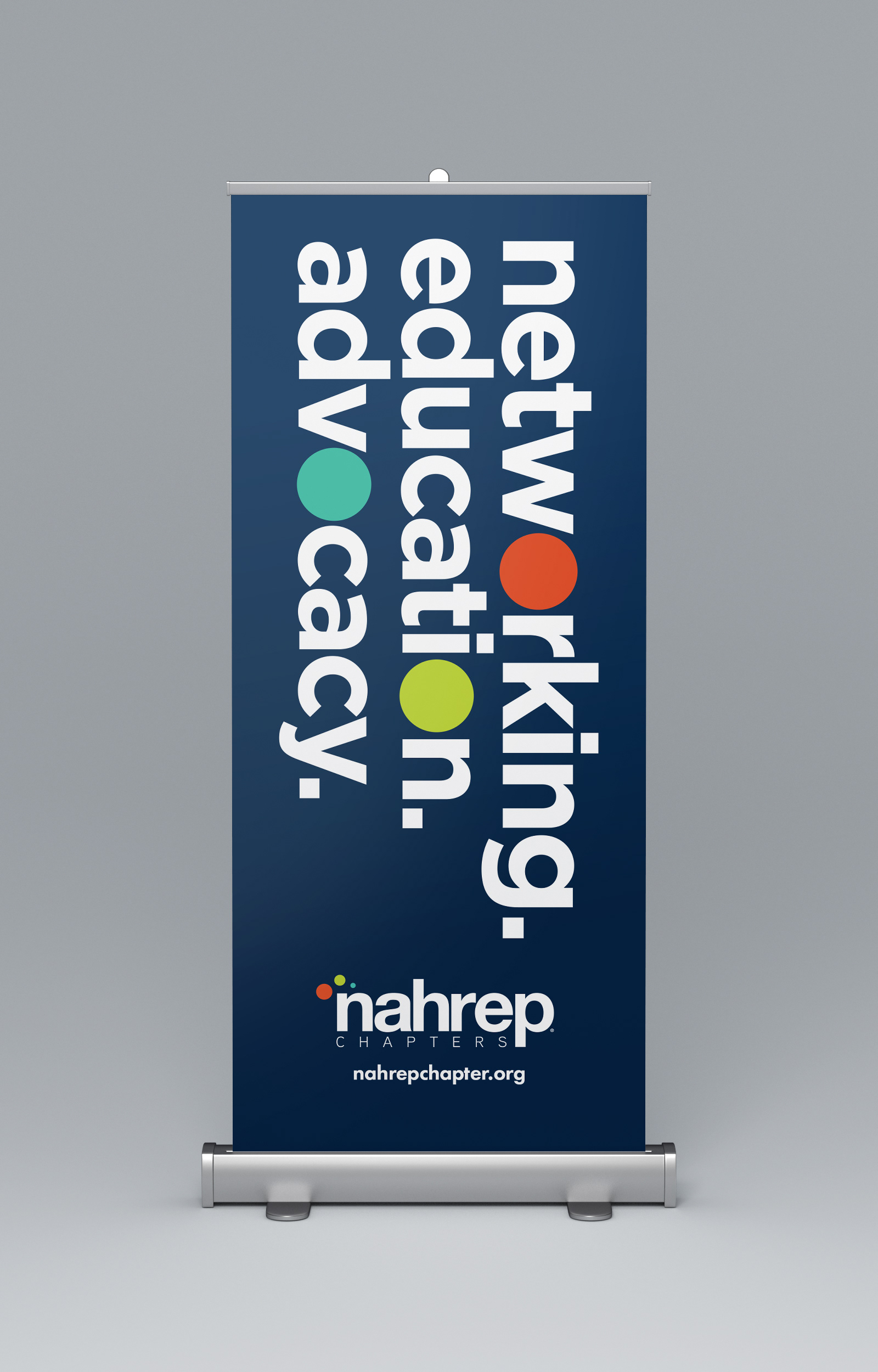
NAHREP's new logo features three different-sized dots in the organization's colors of blue, orange, and a new shade of green, clustered above the letter N. Representing the organization's nationwide network, the dots come together in the logo just as NAHREP members and partners unite for a common mission. Each of the three dots also represents a pillar of NAHREP's mission statement: education, advocacy, and networking. The configuration of the dots is also meant to resemble the roof of a house, a nod to the industry it serves.